In recent years, data has become increasingly important. In particular, many libraries have been created to enable developers and data scientists to explore and visualize data directly in the browser. Plotly.js is one of the most popular data visualization JavaScript libraries, but there is no shortage of competitors.
In detail, CanvasXpress is a new JavaScript library for data analysis and visualization that promises to offer many of the features that have made Plotly so widely adopted, but with a much greater focus on user interaction.
Let’s now learn everything you need to know about CanvasXpress and Plotly, understand what both have to offer, and compare them on the most important aspects to figure out which library is best for you.
What Is CanvasXpress?
CanvasXpress is a standalone, open-source, advanced JavaScript library for data analytics that offers more than 40 chart types. You can see them all here. CanvasXpress works in all modern browsers on mobile, tablets, and desktop devices and is built for the purpose of reproducible research with a sophisticated and unobtrusive user interface.
Also, it offers configuration, complete and effortless data audit trail, and several user interactions. You can find the CanvasXpress repository on GitHub.
You can install CanvasXpress with npm as follows:
npm install canvasxpress
What Is Plotly?
Plotly.js is a high-level, declarative JavaScript charting library that ships with over 40 chart types, including 3D charts, statistical graphs, and SVG maps. Plotly.js is free and open source, and you can view the source, report issues, or contribute on GitHub.

You can install Plotly.js via npm with the following command:
npm install plotly.js-dist
CanvasXpress vs. Plotly
Let’s now look at a head-to-head comparison between CanvasXpress and Plotly, focusing on the most important aspects in a data visualization library.
Supported Programming Languages and Frameworks
Both CanvasXpress and Plotly support the most popular JavaScript frameworks, such as Node.js, React, Angular, and Next.js. Specifically, these are the languages supported by the two libraries:
- CanvasXpress: R, Python, PHP, JavaScript, ggplot, and Dash.
- Plotly.js: Python, R, Julia, JavaScript, ggplot2, F#, MATLAB®, and Dash.
Import and Export Dataset Formats
Both libraries allow you to define charts in JSON format. This enables you to encode the dataset, data visualization logic, and configuration of a chart in a format that can easily be shared between different programming languages.
This is what a JSON bar chart definition looks like in Plotly:
{
  "data": [
    {
      "x": [
        "giraffes",
        "orangutans",
        "monkeys"
      ],
      "y": [
        20,
        14,
        23
      ],
      "type": "bar"
    }
  ]
}
Likewise, this is what the same JSON bar chart definition looks like in CanvasXpress:
{
  "y": {
    "data": [
      [
        20,
        14,
        23
      ]
    ],
    "smps": [
      "giraffes",
      "orangutans",
      "monkeys"
    ]
  }
}
Plotly
- Import data format: JSON, CSV, .xls, .xlsx.
- Export data format: JSON, CSV, .xls, .xlsx, PNG, JPEG, WebP, SVG, PDF.
CanvasXpress
- Import data format: JSON, XML, PNG, CSV, TSV, .xls.
- Export data format: JSON, PNG, CSV, TSV, SVG .xls.
Note that CanvasXpress also supports .png files as a data import format. In detail, you can easily load data from a .png image via drag-and-drop as follows:
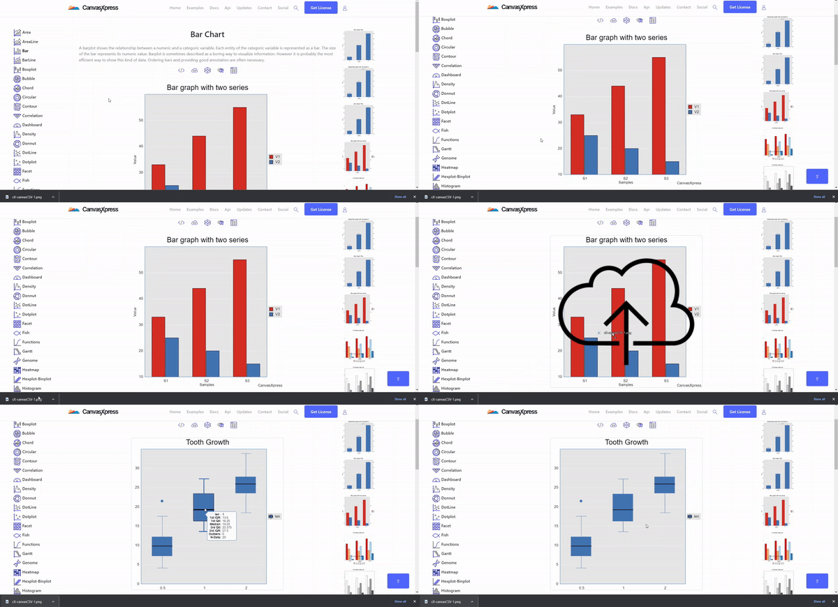
This way, CanvasXpress will not display the same chart as a simple image. Instead, it will automatically extract all the data from the .png image provided as an import, and plot it accordingly in an interactive chart.
Available Charts
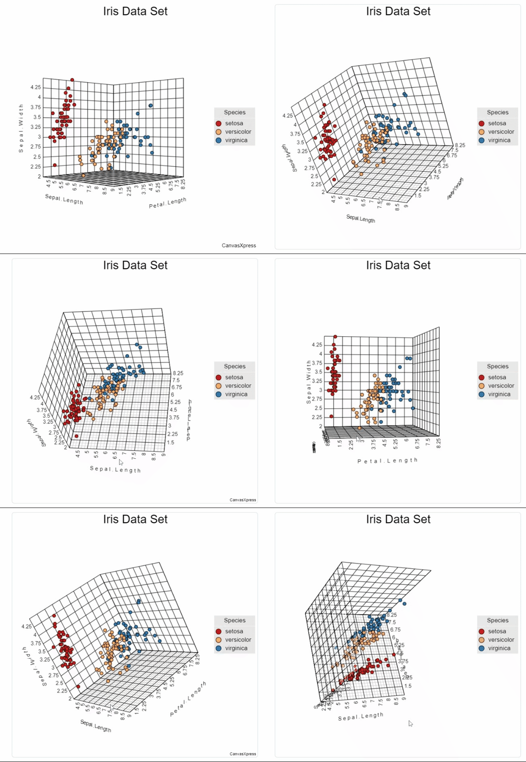
Both libraries support over 40 types of graphs. Showing them all would take too much time. Instead, let’s compare them through two images. Notice that the two data visualization and analysis libraries also support 3D graphs. This means that both allow you to explore data in three dimensions.
CanvasXpress
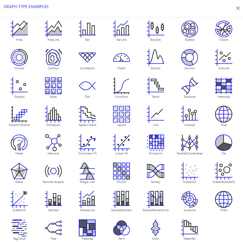
In the left menu of this page, you can find a live example for each chart offered by CanvasXpress.
Plotly
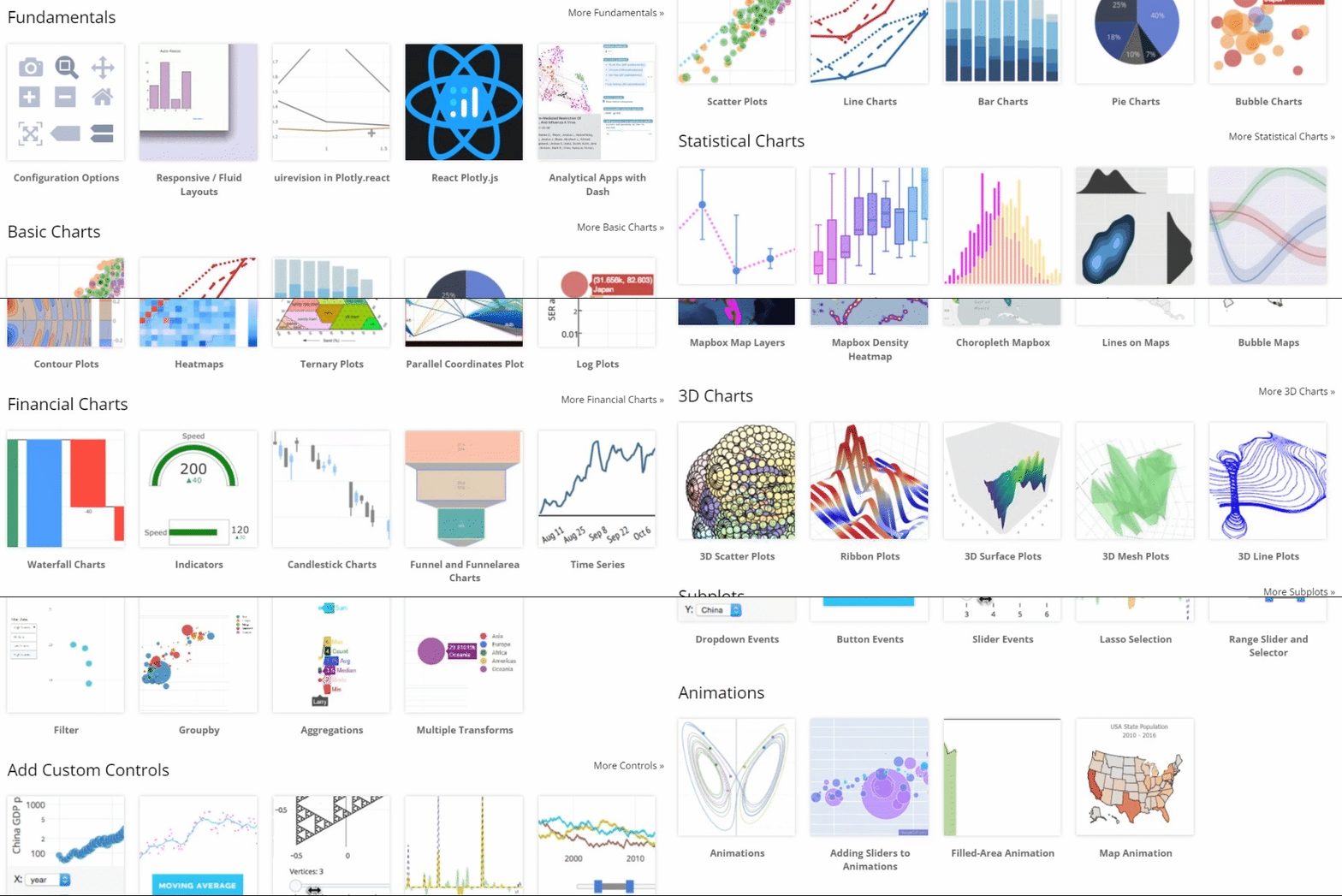
Note that this page contains only a few example charts, organized by category, among all those offered by Plotly. The list of all charts with examples supported by Plotly.js is available here.
Available User Interactions
From what we have seen so far, the two libraries do not appear to be very different. What differs most between CanvasXpress and Plotly is the level of interaction offered to end users.
Plotly
Plotly offers its users only three types of interaction: hover, click, and zoom. You can see all three in action below:
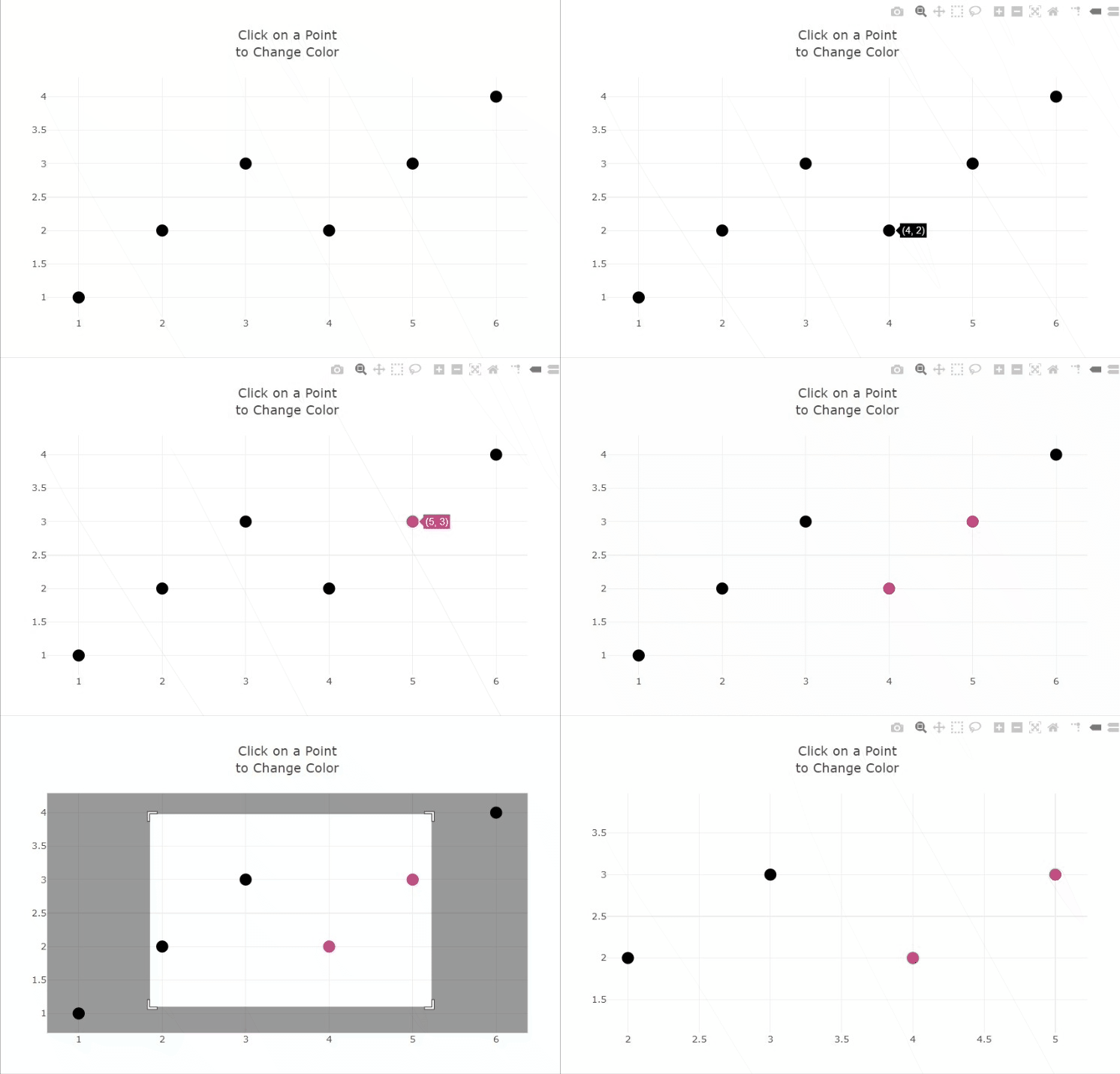
Keep in mind that Plotly allows you to associate custom callbacks with these events. Therefore, you can also change the format, colors, and size of the hover text. This is just an example, and you can learn more about what you can achieve with custom event handlers here. Still, the interactions natively provided by Plotly are decidedly poor.
Also, Plotly comes with a toolbar by default.
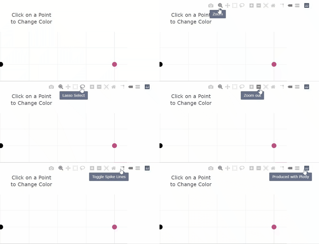
You can activate it by hovering over the upper right corner of any chart, regardless of its type.
Yet, the tools available here are extremely limited when compared to what CanvasXpress natively offers to its users. Let’s dig into this.
CanvasXpress
Analyzing in detail all the interactions CanvasXpress natively comes with would take too much time. You can see them all here, but let’s only focus on the most important ones. Keep in mind that the interactions shown here are present natively on each chart, regardless of its type.
This is what basic interaction in CanvasXpress looks like:
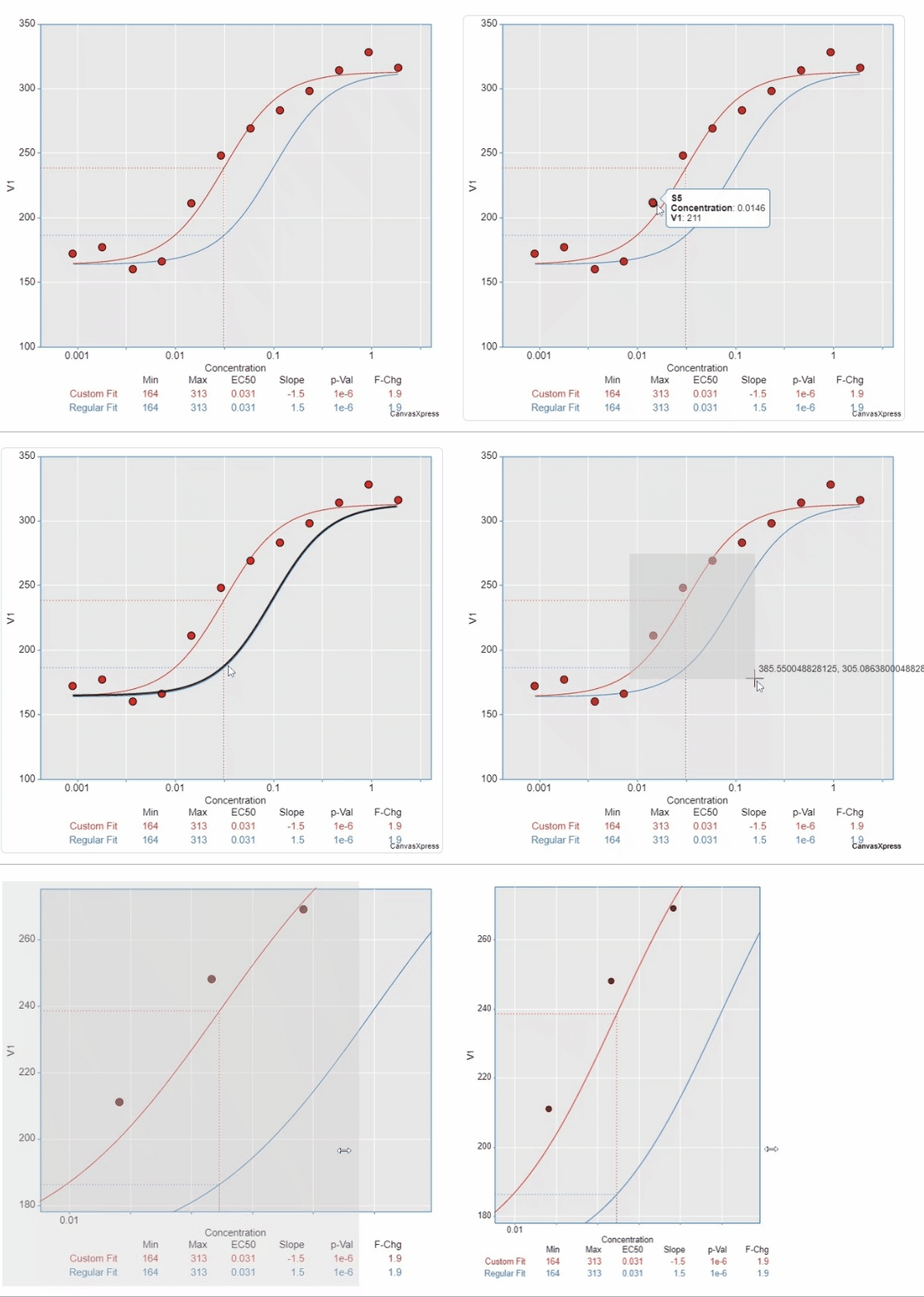
As you can see, this involves hovering, clicking, resizing, and zooming. Other interactions can be achieved through the toolbar that is activated by hovering the mouse over the upper right corner of any chart:
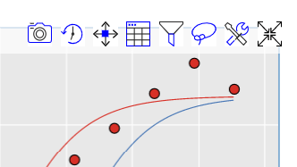
These buttons allow you to:
- Export the chart to a .png file
- Reproduce the interaction you have had with the chart so far in a sort of interactive video
- Move the canvas
- View the dataset plotted in a table format
- Explore data and change it on-the-fly
- Perform a Lasso select
- Enter the customization window
- Enter the full-screen more
Specifically, clicking on button 7. brings up the “Customization” window below:
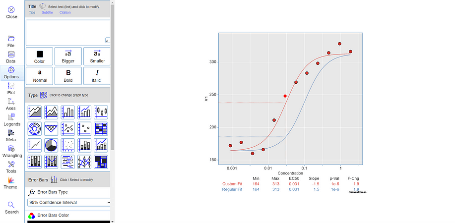
Here, CanvasXpress provides several tools to change the data, type, and look-and-feel of the chart in real-time. This advanced mode is available for each chart and offers endless possibilities.
In addition, by right-clicking on a chart, you can access several other functions to customize and interact with it.
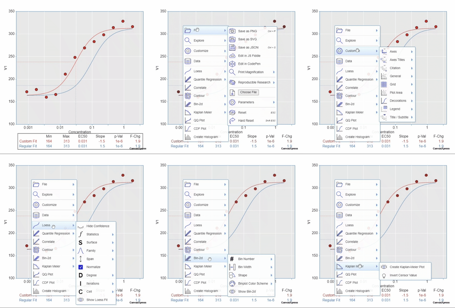
Here are shortcuts to many of the features you can explore in the “Customization” window seen above.
Lastly, CanvasXpress allows you to link the interaction of multiple graphs via broadcast events:
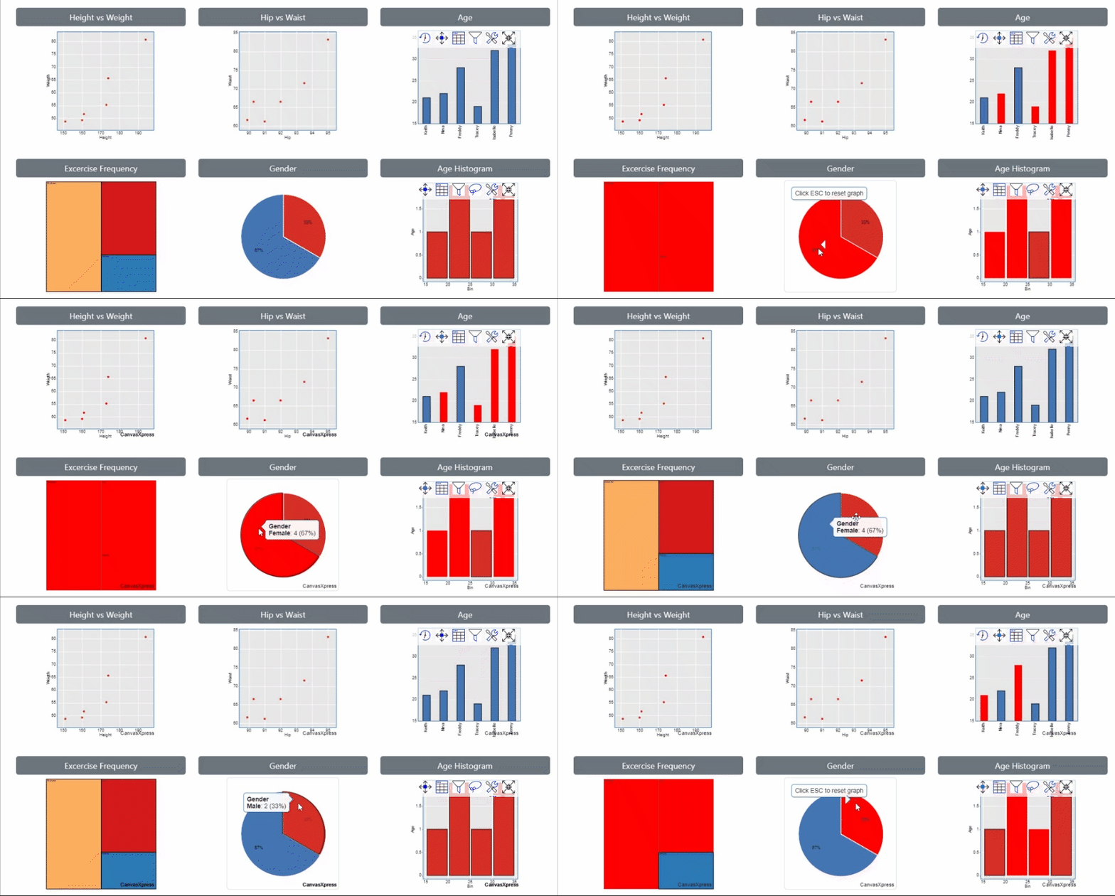
Keep in mind that, for the sake of simplicity, here we have only scratched the surface of what CanvasXpress offers its users. Plus, do not forget that you can customize the way a chart reacts to user behavior in the code. You can have a closer look at what CanvasXpress has to offer when it comes to user interaction in the official documentation.
Which One Should You Choose?
Plotly.js is a mature project that has a large community and high-quality documentation. However, it falls short when it comes to user interaction and tools offered natively to end users. This means that it is the perfect library to statically plot and explore data, if you need the support of the community, or if you do not expect end-users to interact heavily with charts.
On the other hand, if you want to provide your end-users with ways to play and interact with data directly on the chart, you should consider CanvasXpress. Although it is a relatively new project, the interactions it offers natively are impressive, and sometimes it even feels magical. In detail, CanvasXpress seems to be the perfect tool for data scientists and experienced users, as it allows them to play with the dataset in real-time to study what happens as a result.
Conclusion
In this article, you saw a head-to-head comparison between CanvasXpress and Plotly to help you choose the best library for your needs. Plotly.js is one of the most widely adopted JavaScript data visualization libraries. Therefore, although there are dozens of similar libraries, Plotly represents a benchmark. In contrast, CanvasXpress is quite new, and it offers a fresh approach to data visualization and analysis. This is because CanvasXpress natively comes with many more user interactions than Plotly, allowing you to explore and play with data in ways never seen before.
Thanks for reading! I hope that you found this article helpful.